UI Editor |
UI Editor
 ContentsOverview
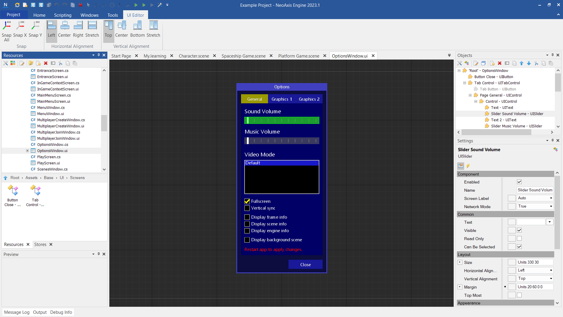
UI editor is designed for configuring user interface elements of a project. The editor could be used to create windows, forms, HUD screens and UI controls. You can script controls same way as another components in the editor.
 Creating UI controls
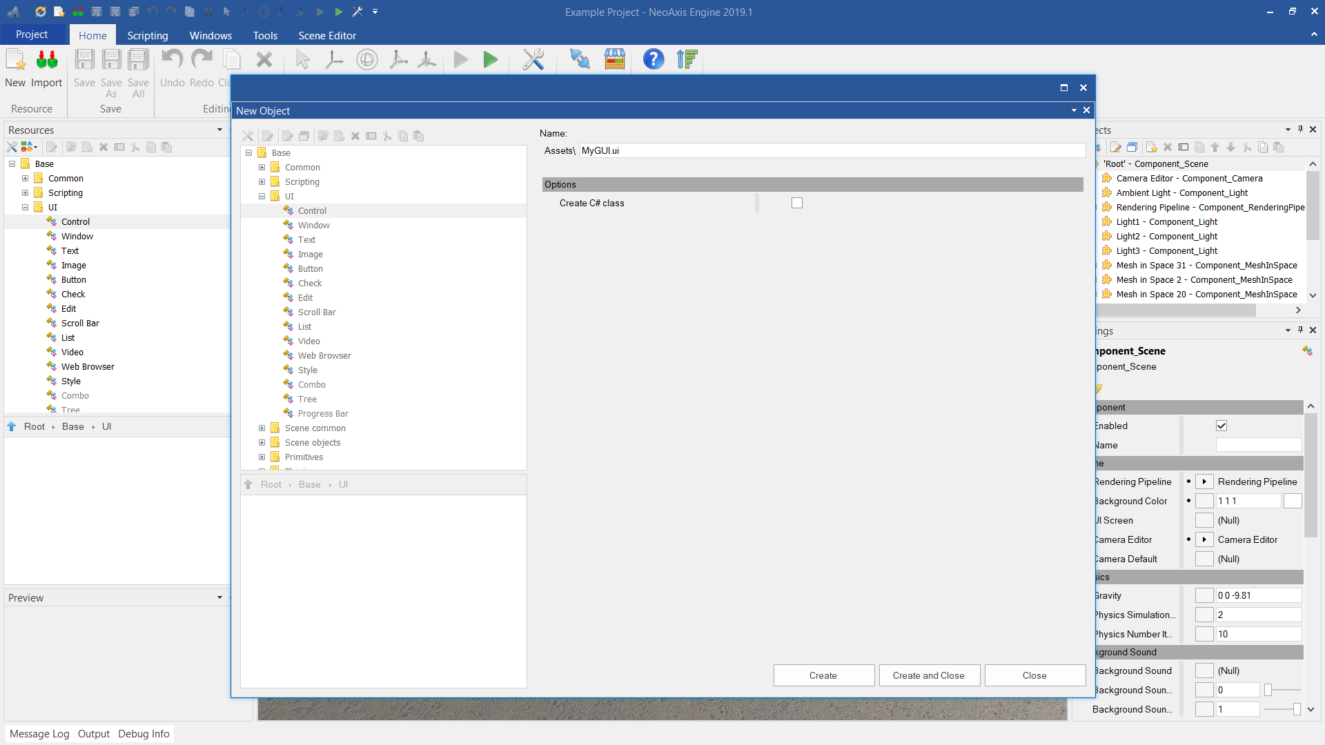
New UI control can be created as a separate resource or inside an existing object. Read more about creating resources.
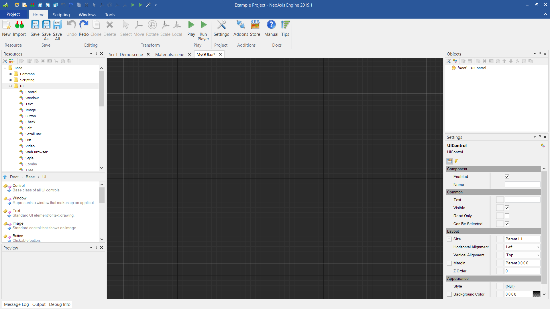
When creating a resource, one should select the control that will be root. For example, it could be Window or empty Control. After creation a canvas for editing will appear.
 Editing UI controls
UI editor works in the same way as any other NeoAxis editors. Simplest way to create a control is to drag & drop those from Resources Window.
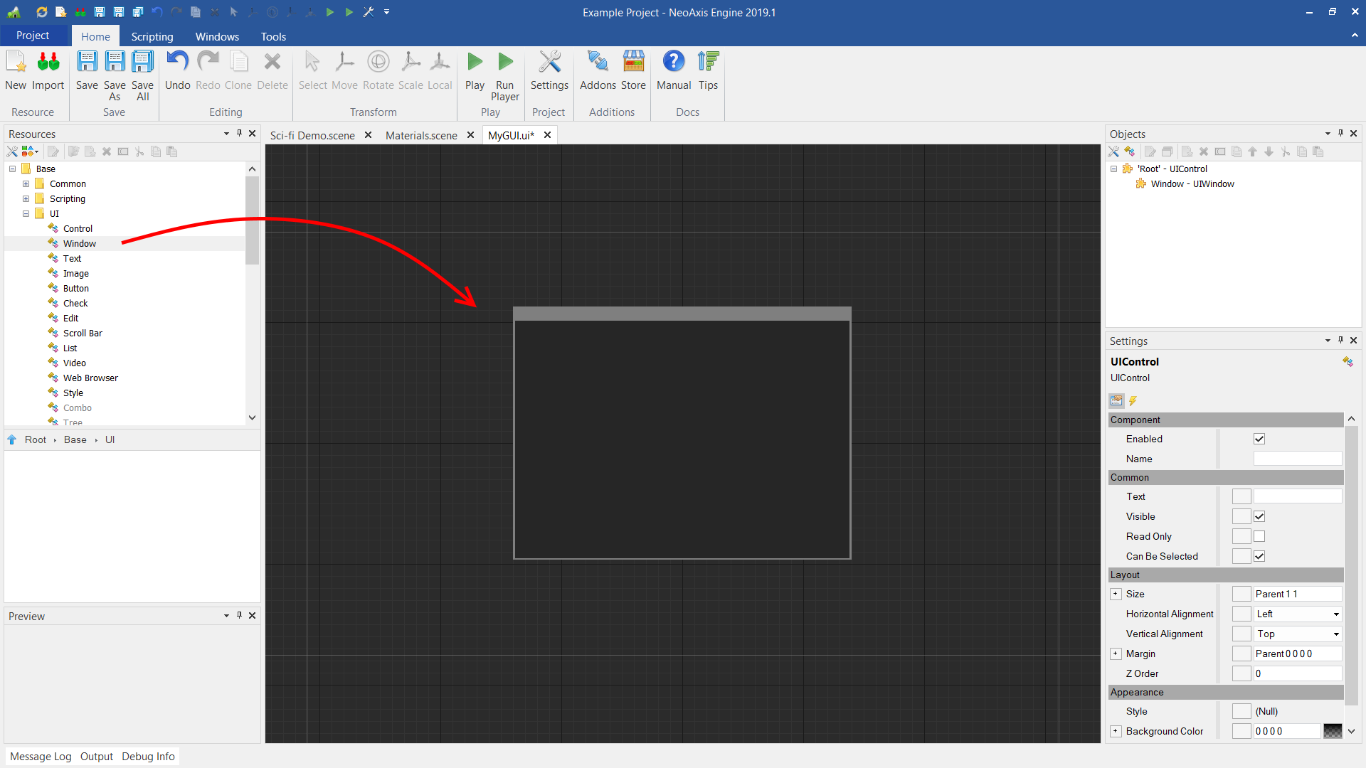
Nested controls can be created in the same way.
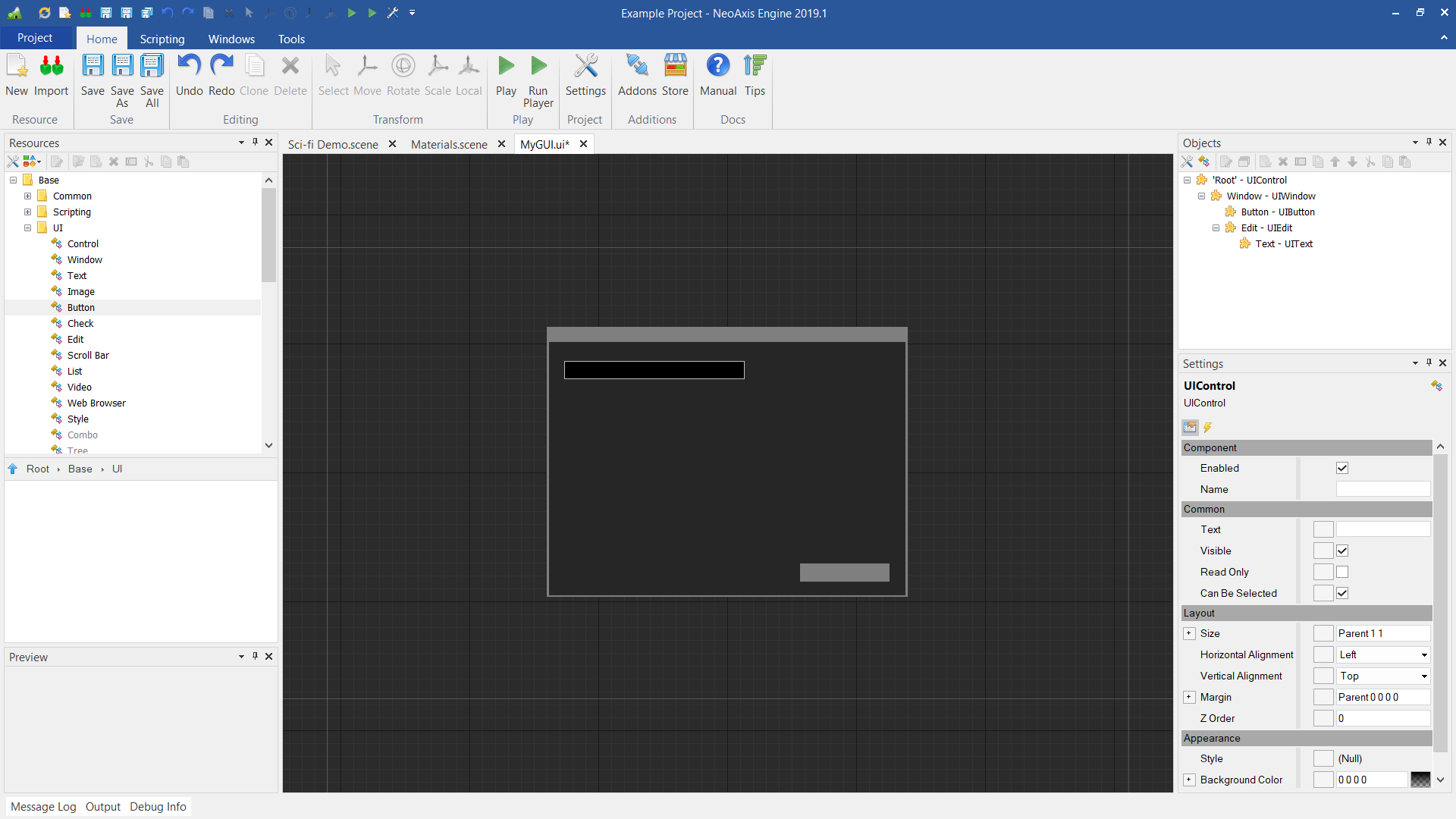
Controls can be selected via mouse, it's settings can be adjusted in the Settings Window.
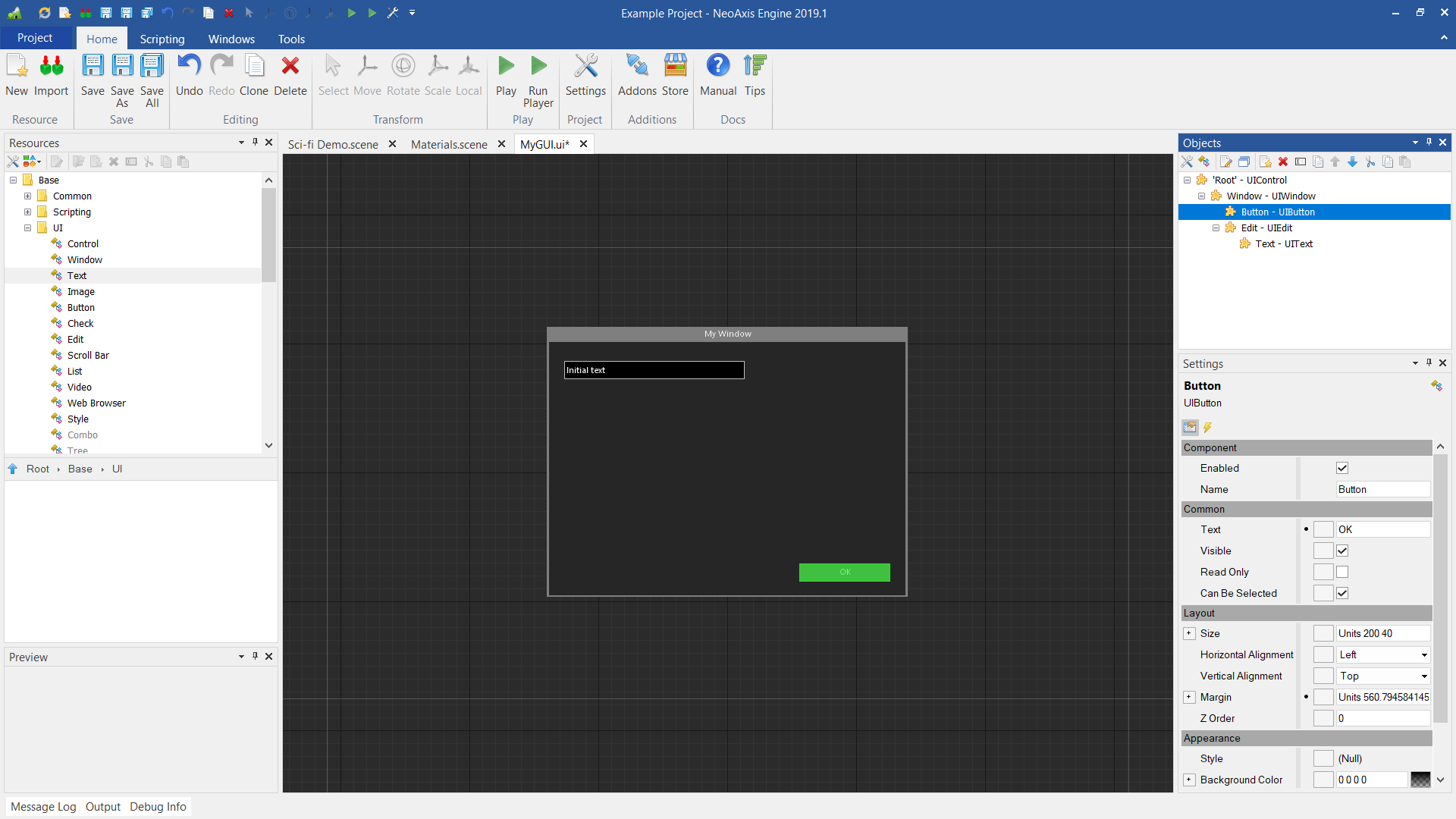
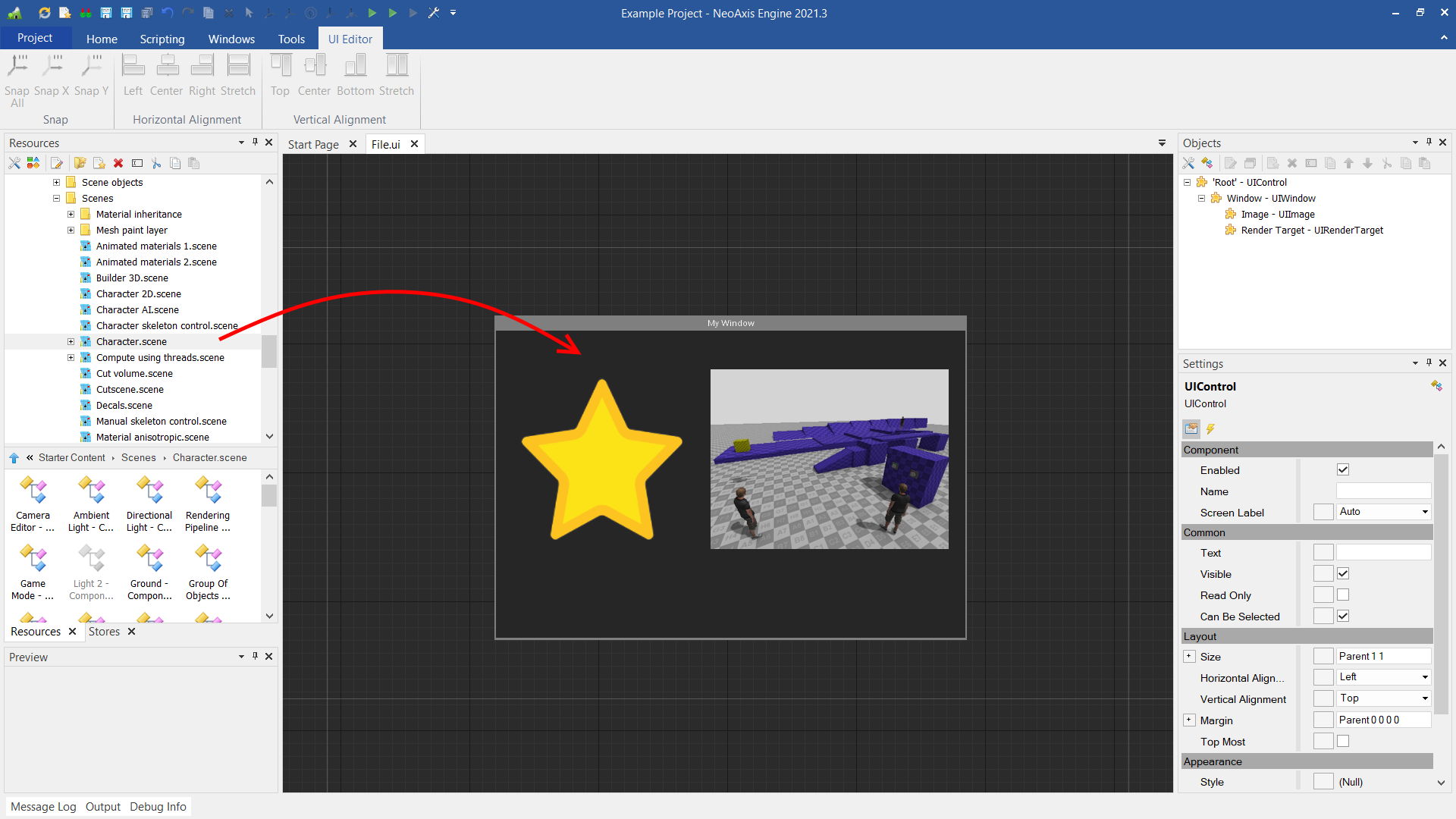
Images and scene files is also supports dropping to the canvas.
 Ribbon tab
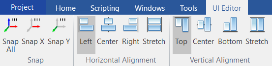
When the scene editor is activated, 'UI Editor' tab appears in the Ribbon. The tab has additional tools for editing.
| Name | Description |
|---|---|
 | Align selected objects positions along both axes. The step of alignment can be configured in Project Settings. |
 | Align selected objects positions along X axis. |
 | Align selected objects positions along Y axis. |
 | Sets the horizontal left alignment for the selected controls. |
 | Sets the horizontal center alignment for the selected controls. |
 | Sets the horizontal right alignment for the selected controls. |
 | Sets the horizontal stretch alignment for the selected controls. |
 | Sets the vertical top alignment for the selected controls. |
 | Sets the vertical center alignment for the selected controls. |
 | Sets the vertical right alignment for the selected controls. |
 | Sets the vertical stretch alignment for the selected controls. |
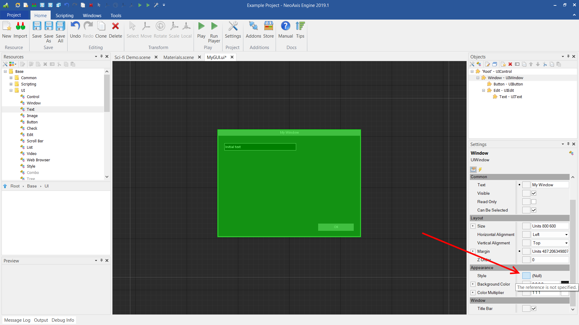
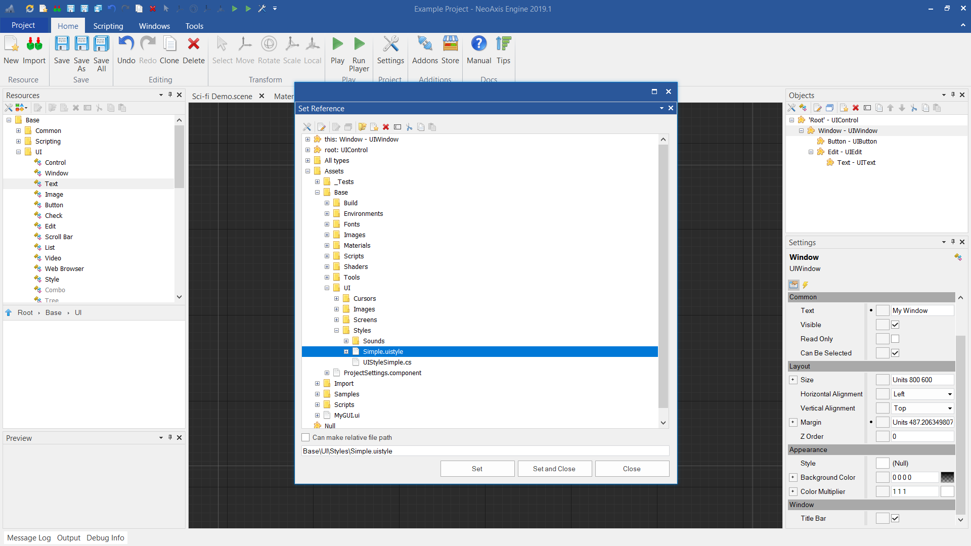
UI StyleControl's appearance could be customized with UI Style object. Style can be applied both to a separate control and to a whole hierarchy.
In order to set a style, one should select control and Reference button of Style property.
Select desired style in appeared window. The engine has Simple.uistyle, as an example, which can be found at Assets\Base\UI\Styles.
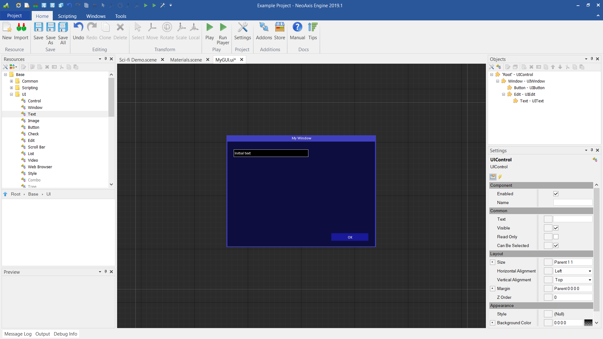
Final result:
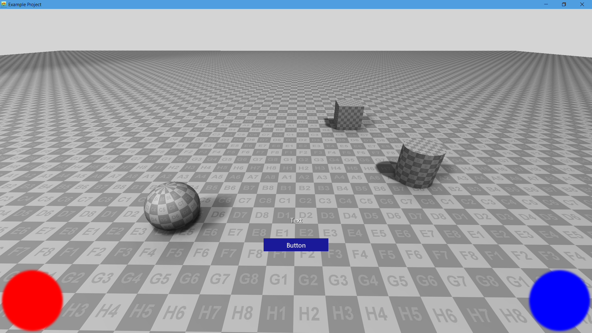
 UI control as a head-up display
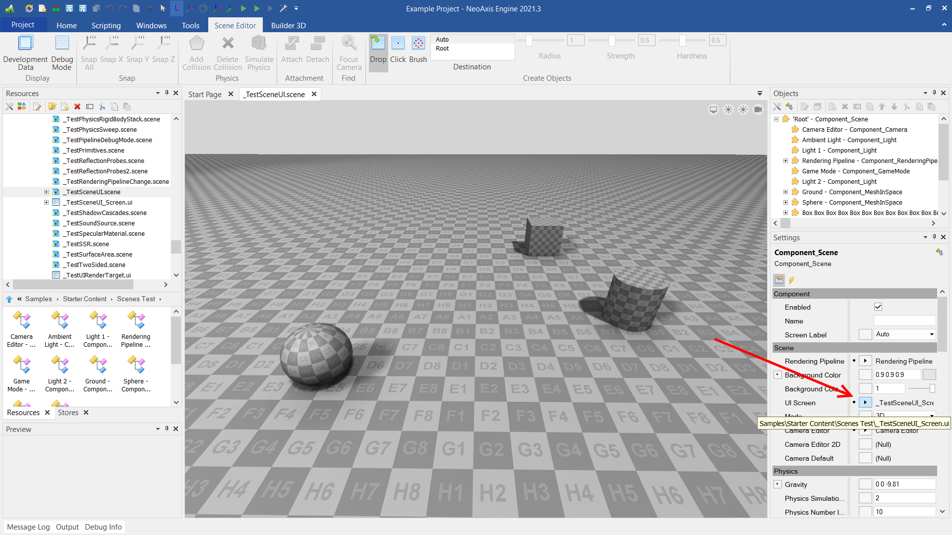
Scene supports attachment of UI control as a head-up display (HUD).
To do so, one should open a scene, select scene object, and set UI Screen property. An example can be found in the Assets\_Tests folder, _TestSceneUI.scene and _TestSceneUI_Screen.ui files.
Result in the Player:
 See also