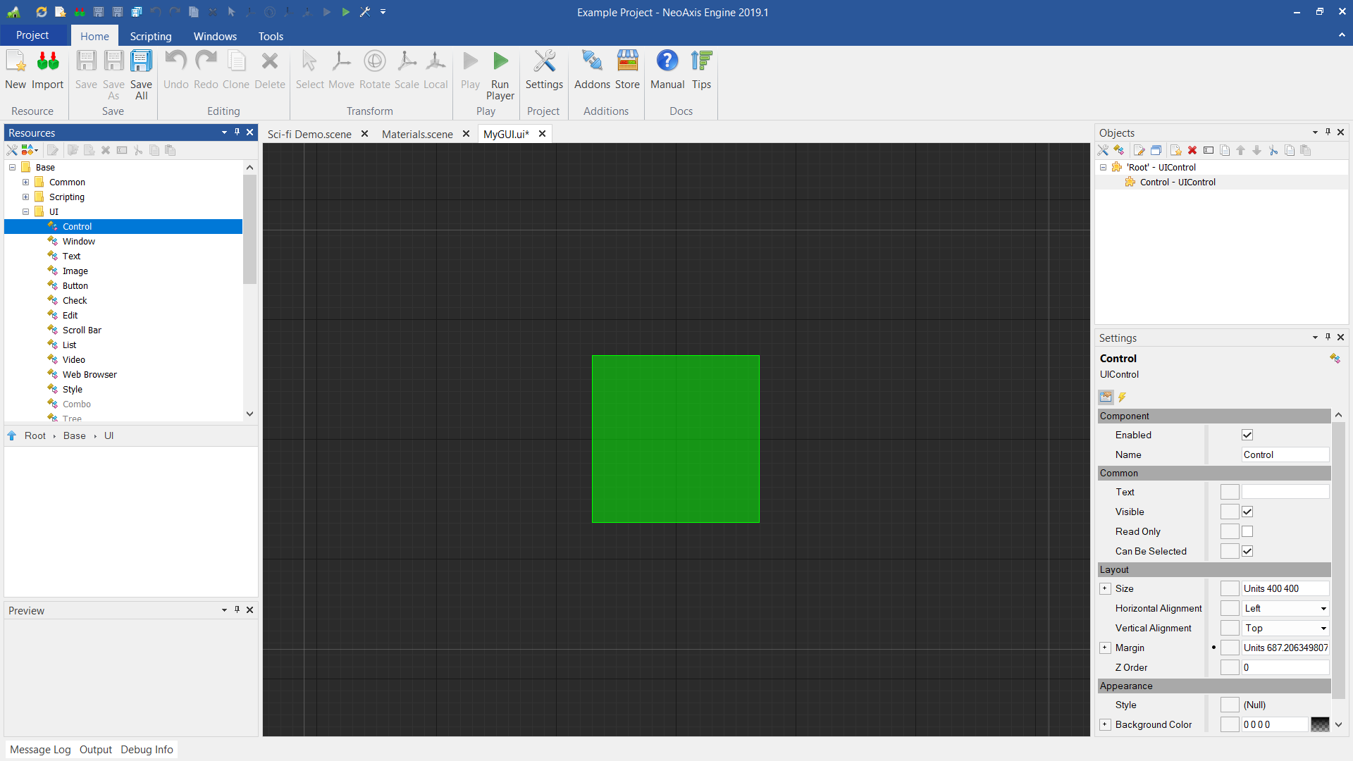
Control
Base class of all UI controls.
 Properties
| Name
| Description
|
|---|
| Text
| The text value of the control.
|
| Visible
| Whether the control is visible.
|
| Read Only
| Whether the control is read-only.
|
| Can Be Selected
| Whether the object is selectable in editor view.
|
| Size
| The size of the control.
|
| Horizontal Alignment
| The horizontal alignment of the control.
|
| Vertical Alignment
| The vertical alignment of the control.
|
| Margin
| The margin of the control.
|
| Top Most
| Whether the control is rendered on the top.
|
| Read Only In Hierarchy
| Whether the control is read-only in hierarchy.
|
| Style
| The style of the control.
|
| Background Color
| The background color of the control.
|
| Background Rounding
| The background rounding size.
|
| Color Multiplier
| The extra color multiplier applied to the control.
|
| Mouse Position
| The current mouse pointer position in the local coordinates of the control.
|
| Parent Container
| The parent container of the control.
|
| Focused
| Whether the control is focused or not.
|
| Can Focus
| Whether control can be focused.
|
| Screen Clip Rectangle
| The clip rectangle of the control.
|
| Can Clone
| Whether the control is cloneable.
|
| Special Shader
| The special shader of the control.
|
| Special Shader Apply To Children
| Whether special shader is applied to children.
|
| Editor Scroll Position
| The editor scroll position of the control.
|
See also 